UI/UX design
Wits World's interface connects campus exploration, card collecting, and battles. The design puts the information needed for a decision beside its controls, with secondary detail available when the user wants to inspect it.
Players and authors
Players often use the game on a phone while moving around campus. Their layouts prioritise short decisions, touch controls, and focused content. Desktop layouts add space for card comparisons and battle context.
Authors work with lists, filters, editors, previews, and review history. A separate console gives these longer tasks their own navigation while retaining access to the player application. Its desktop layouts support content management; smaller screens use compact navigation and vertically arranged forms.
Navigation and hierarchy
Explore, Collection, and Battles group features around the player's task. Decks, evolution, and trading sit with the collection; battle entry and history sit with battles. Account settings and profile information have separate destinations.
The main action and its immediate context take priority. Card details, tabs, expandable sections, and contextual panels expose additional information without putting every control on the initial screen.
Layout choices
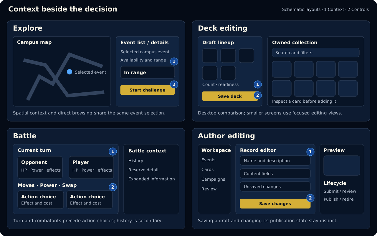
Layout illustrations of the current interaction patterns, rather than screenshots. They show content relationships; spacing and controls adapt to the screen.
Explore: map and list together
The map provides spatial context; the event list supports direct browsing. On phones, event information opens in a sheet over the map. Desktop layouts put it beside the map. Availability and range status belong with the selected event's challenge action, so the player can assess access before starting.
The list also provides access to event information when the map is unavailable. Exploration does not depend on manipulating the map.
Decks: draft and collection together
Desktop editing places the lineup beside the collection for comparison. Smaller screens use focused deck and collection views, with card count, readiness, and save state kept in the editing flow.
Inspecting a card does not add it to the draft. Search and filters preserve chosen copies. The viewed deck and active battle deck are distinguished, so browsing and editing do not silently change the next match's selection.
Battles: actions beside their consequences
The current turn, active Creatures, HP, Power, and effects support the next decision. Moves show effects and costs together. On phones, combatants stack above the actions; on desktop, history and reserve detail can sit beside the battlefield.
This keeps action selection readable while making the relevant battle context available. Longer descriptions can grow with the page rather than being clipped into a fixed-height action area.
Authoring: editing and publication are separate
Save state and actions belong with the editor. Submission, review, approval, and publication are separate lifecycle controls. This distinguishes a saved record from content made available to players and reduces ambiguity about what a button will change.
Visual identity
Dark navy surfaces and ivory text provide the base for campus imagery and collectible artwork. Gold appears in primary actions, branding, and prestigious card treatments; blue identifies selection, focus, and interactive detail. Semantic messages pair colour with explicit text.
Fonts
Source Serif 4 is used for page titles, card names, reward headings, and prominent game text. Its serif letterforms give these elements an academic, editorial character that fits the campus setting. Using it selectively gives important names and moments emphasis without making every label decorative.
Source Sans 3 is used for body text, navigation, buttons, forms, status messages, statistics, and Author workspaces. Its simpler letterforms suit compact controls and information that needs to be scanned quickly. Keeping these roles consistent helps users recognise headings, content, and actions across screens.
The Plain sans-serif accessibility option also replaces the serif headings with Source Sans 3 for users who prefer one font throughout the interface.
Responsive imagery
Campus and achievement artwork use image sizes suited to the displayed area, screen density, and interface size preference. This keeps images proportional and detailed as the layout changes without downloading the largest version for every view. Resizing preserves the original artwork and transparency.
Achievement dialogs retain an available badge preview while the larger image loads. A missing preview has a stable medal placeholder. Campus artwork is prepared with the offline shell; achievement artwork is not automatically prepared for offline use.
Card presentation
Collection, deck picking, card details, evolution, Author previews, and revealed battle cards use the same frame structure: a recessed square artwork window and a lower plate for the name, rarity, and quantity where relevant. Consistent presentation helps players recognise a card across these contexts.
| Rarity | Frame treatment |
|---|---|
| Common | Ivory and silver metal with restrained engraving |
| Rare | Deep blue enamel with metallic engraving and a star crest |
| Epic | Violet metalwork with layered lines and orbital detail |
| Legendary | Layered gold with a dark inset plate and a prominent crest |
Rarity has a written label. When a battle record has no rarity, its frame uses a neutral finish without guessing a tier. Selection and keyboard focus remain separate from rarity; quantities and retirement use text.
Artwork fits without cropping or stretching. Compact cards simplify engraving, while larger views reveal more detail. Missing artwork has a neutral fallback. Card content is documented in the Card catalogue.
For input, focus, and reading preferences, see Accessibility. For waiting, errors, and confirmations, see Interaction states.
AI declaration: Written and revised with assistance from Codex[GPT-6].